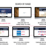
There is a widespread belief that stock photographs are unsuitable for company advertising because they lack authenticity and do not connect with the services you give and how you display them. Today, when you search for photographs that correspond to unique and unusual concepts, you will be astounded to discover high-quality and amazing content that is up to date with the newest trends. Checkout our newly added Stock Photos of the latest trends.
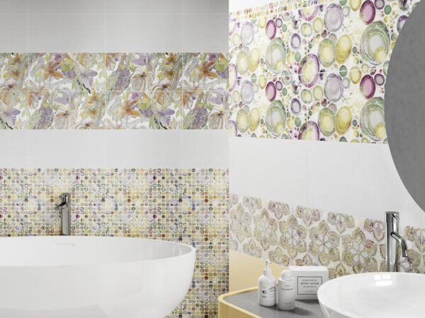
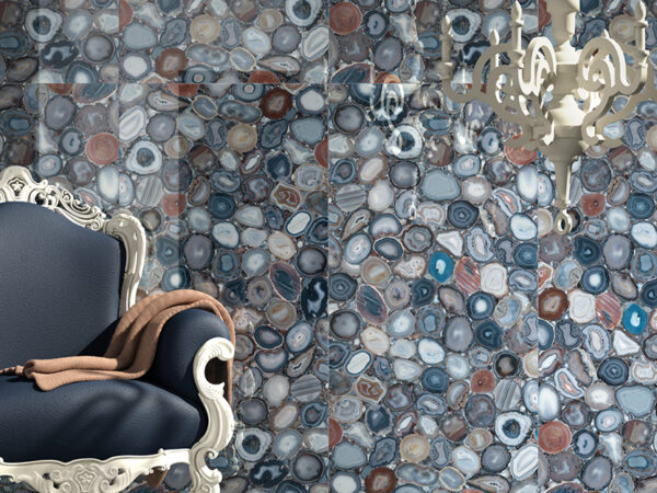
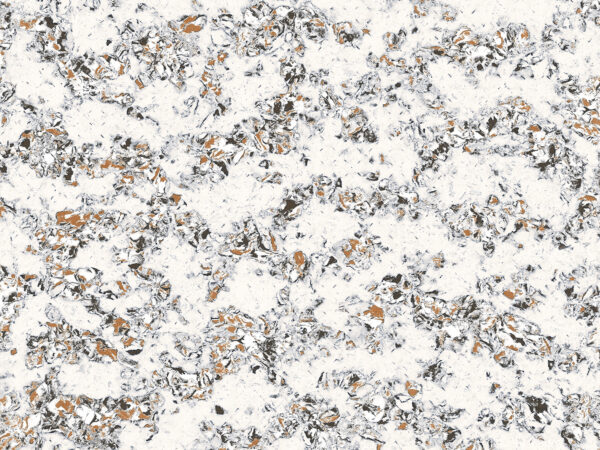
With so many stock pictures available, selecting the ideal one should be too difficult. Particularly since we recently added millions of photographs to Cliqstock. We now have many beautiful and lavish stock photographs of Marble designs, Laminate Designs, Nature, Wildlife, Food, and many more.
However, you may still be confused about how to include stock photographs into your design. Let’s help you out there.
1. Find the Perfect Image by using Strategic Keywords.
Many individuals fail to see the true usefulness of stock photographs and rather choose the first one that just vaguely matches their project. Instead, take the effort to pick a photo that is a good fit for your design’s theme and intended style.
Set some strategy for what you’re looking for:
- Fit your product’s theme
- Conform to the branding
- Complement the colour scheme
- Maintain a professional appearance.
- Distracting features should be avoided.
2. Make themed Backgrounds
Use stock photographs in the background of your projects. When you select the right background image that fits your brand’s style, consider how you can make it appear more than simply a plain photo.
You can add text overlays, colour filters, or graphic components to your background photos to improve their appearance and functionality.
Check whether you can use your own brand colours when applying colour overlays to your images. This may assist your designs stay on brand and resonate with your target audience.
3. Use Picture Frames to keep the Size and Shape constant
It might be tough to obtain stock photographs that are all the same size if you want to combine many source photos into your design. Some may be portrait, while others may be landscape or even square.
Image frames are very useful in this situation. Image frames trim photographs to a specified size and shape automatically. This will assist you in making your photos consistent and coherent.
4. Make your Headers More Interesting
Stock photographs, whether for a landing page or an infographic, are a wonderful way to make your header stand out and get the attention of your readers.
Viewers will often see your headers first. Make an excellent first impression by using a meaningful image that contributes to the main subject or issue.
The stock photo in the header attracts attention right away and establishes the tone and colour pattern for the rest of the infographic.
5. Add Some Borders
Along with adding stock photographs in your backgrounds, employ them as eye-catching borders as well. A border might help to tie the entire design together. It has the ability to frame your information.
Borders and frames not only offer your designs a good aesthetic, but they also make it simpler for your audience to connect with your information.
6. Make use of it in Mockups
Stock pictures provide fantastic placeholder material. If you offer creative services, you can utilise stock photographs instead of physical prototypes to show your clients how the final version of your design would appear.
This is not only a cost-efficient technique to do your tasks, but it is also quite effective.
7. Design around the Background Picture
Another interesting method to utilize stock photography into your designs is to add text and other components within or around the stock photographs.
There is no one method to achieve this, although it is best to select photos with empty spaces to make this work.
Rather than making the photo subordinate to the text, the text is merged into the image diagonally. Everything feels more consistent and professional as a result.
However, not every photograph you come across may be used in this manner. The photograph must be reasonably flat or captured from straight above where empty space is available in the image.
8. Add Texture and Pattern to Pictures that are Simple
Another clever use of stock photography is to include a texture image that adds depth, dimension, and style to your design. The stock photo can fade into the background at times. Instead of being the major focus, it gives a modest touch of flare to the image.
In these cases, use basic graphics with a pattern or texture. These basic background photos will give depth to your designs and make them more fascinating.
Start by searching “pattern,” “texture,” or “surface” to discover a nice variety of stock photographs like these. Additionally, searching for more precise phrases yields a plethora of interesting instances. For some unique designs, try “wood,” “marble,” “fabric,” or “wall.”
9. Create eye-catching Collages
Stock photographs can be used to make fascinating collages that bring colour and personality to your design.
The collage arrangement can be chosen based on the quantity of photographs you wish to use on your website, eBook covers, presentations, or social media graphics.
10. Use Images with similar Themes throughout multiple pages
Design consistency is critical and may make or break any visual. It’s much more critical if you’re working on anything with several pages or elements.
The simplest method to establish aesthetic consistency is to use stock photographs that share a colour palette. Another technique to keep things similar on each page is to find a common aesthetic motif across all photographs. These photos don’t have to be identical, but they should appear like they belong in the same design.
Conclusion
You can improve your designs by following these ten basic stock picture suggestions.
When utilising stock photographs, the most crucial things to remember are:
- To make images seem more consistent, use colour filters and image frames.
- Follow your brand’s guidelines.
- Allow for white space in your design so that your content and graphics may breathe.
- Choose stock images with consistent colour palettes, styles, and compositions.